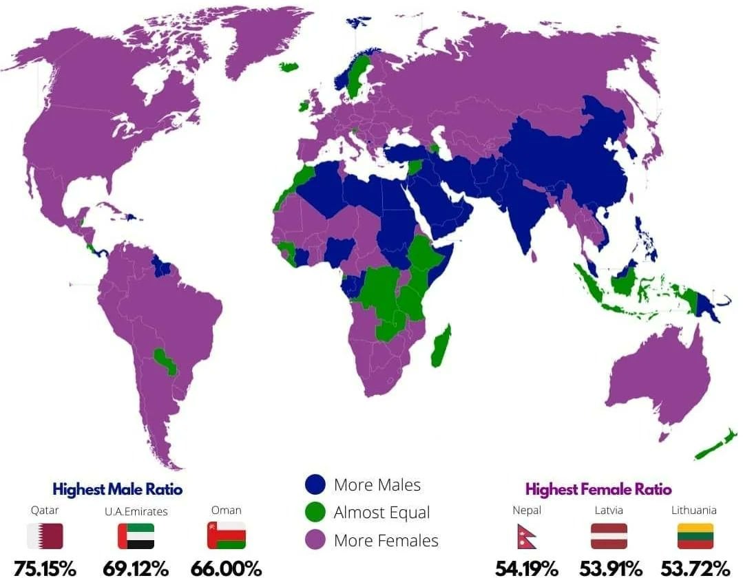
I find the top three ratios interesting: there’s a tiny skew towards females but a huge skew towards males.
It doesn’t show what the green threshold is though. From memory, the natural birth ratio is 49:51 m:f, so the female skew is only about 3% while the male skew is about 20%. Seven times larger.
If I were colouring the map, I don’t think I’d have bothered with differentiating purple and green, or perhaps used more graduations.
Just a guess, but I think the difference in a country like Qatar can be explained by the import of labor. They hire a workforce from a different country which tend to be dominantly male in those regions. And we’ve seen with the football WC how they’re developing.