
LabPlot
#LabPlot is a #free, #opensource and cross-platform #data #visualization and #analysis #software #accessible to everyone and trusted by #professionals.
• High-quality interactive plotting
• Reliable and easy data analysis, statistics, regression, curve and peak fitting
• Computing with interactive Notebooks (Python R Maxima Octave and more)
• Data extraction from plots and support for live data
• Smooth data import and export (many file formats)
• Runs on Windows, macOS, Linux, BSD, Haiku, GNU
- 6 Posts
- 7 Comments
 1·6 days ago
@europesays @UnitedStates @[email protected] @dataisbeautiful
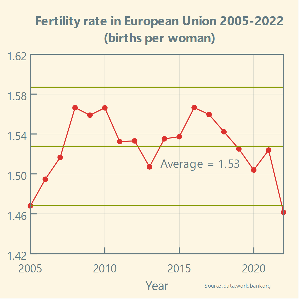
Has the #FertilityRate in the #US been stable over the past two decades? And how does it compare to the #EU?
Boosts appreciated! :boost_love:🚀
#Europe #Future #EU #Europa #Fertility #Politics #Healthcare #Health #BirthRate #Demography #Population #Biology #News #Community #Statistics #FreeSoftware #OpenSource #ControlChart #LabPlot #Data #dataViz #USA #America #Trump #Musk
@coucouf @europesays @[email protected] @dataisbeautiful
Let us reply by quoting Howard Wainer. In his well-known paper “How to Display Data Badly” he wrote:
“A second way to hide the data is in the scale. This corresponds to blowing up the scale (i.e., looking at the data from far away) so that any variation in the data is obscured by the magnitude of the scale. One can justify this practice by appealing to “honesty requires that we start the scale at zero,” or other sorts of sophistry.”
@hanscees @kde @europesays @dataisbeautiful @[email protected]
Thank you for your comment. We are just following the definition of the fertility rate by the World Bank Group:
👉 https://data.worldbank.org/indicator/SP.DYN.TFRT.IN?locations=EU
@europesays @[email protected] @dataisbeautiful
Simply asking two primary questions to guide any analysis will lead to a better understanding of variation and more effective decision making:
1️⃣ Is the process currently stable?
2️⃣ Based on this knowledge, what type of action makes sense?👉 https://healthleadsusa.org/wp-content/uploads/2018/10/understanding-variation26-years-later.pdf
In this paper Thomas Nolan, Rocco J. Perla and Lloyd Provost explain why correctly assessing #variation is fundamental to sound decisions.
 4·7 days ago
It depends on the expected functionality. You can check the existing features here:
➡️ https://labplot.org/featuresWe are currently working on expanding #LabPlot’s functionality in these areas:
▶️ Live Data Analysis
▶️ #Python Scripting
▶️ Statistical Analysis
▶️ Quality Improvement Charts
@coucouf @europesays @[email protected] @dataisbeautiful
Thank you for your comment. For these types of charts describing variation in data, which also include upper and lower limits on the values that contain probable noise, not using 0 at the start on the y-axis makes sense, as it makes it easier to analyze this variation and detection of potential signals.
We believe that Howard Wainer certainly would not recommend blindly applying this principle to all cases.