
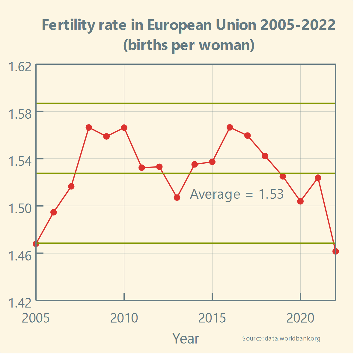
Has the #FertilityRate in the #EuropeanUnion been stable over the past two decades?
A simple #XmR chart available in @LabPlot [2.12dev] can be used to track the stability of any process.
Boosts appreciated! :boost_love:🚀
➡️ https://en.wikipedia.org/wiki/Shewhart/_individuals/_control/_chart
@europesays @dataisbeautiful @[email protected]
#Europe #Future #EU #Europa #Fertility #Politics #Healthcare #Health #BirthRate #Demography #Population #Biology #News #Community #Statistics #FreeSoftware #OpenSource #ControlChart #LabPlot #Data #dataViz
not to be confused with the fertility rat, which has been very unstable over the last decade
@[email protected] @kde @europesays @dataisbeautiful @[email protected] thats not ferility rate. Ferility rate is the number of pregnancies after trying 1 month. This is something completely different
@hanscees @kde @europesays @dataisbeautiful @[email protected]
Thank you for your comment. We are just following the definition of the fertility rate by the World Bank Group:
👉 https://data.worldbank.org/indicator/SP.DYN.TFRT.IN?locations=EU
@[email protected] @kde @europesays @dataisbeautiful @[email protected] ok, apparently that is common use. I stand corrected.
Wikipedia defines it as:
The total fertility rate (TFR) of a population is the average number of children that are born to a woman over her lifetime.
@[email protected] @europesays @[email protected] @dataisbeautiful what about starting the y axis at 0 so you don’t give the wrong impression that it’s widely moving from year to year ?
@coucouf @europesays @[email protected] @dataisbeautiful
Let us reply by quoting Howard Wainer. In his well-known paper “How to Display Data Badly” he wrote:
“A second way to hide the data is in the scale. This corresponds to blowing up the scale (i.e., looking at the data from far away) so that any variation in the data is obscured by the magnitude of the scale. One can justify this practice by appealing to “honesty requires that we start the scale at zero,” or other sorts of sophistry.”
@[email protected] @europesays @[email protected] @dataisbeautiful very nicely framed but unconvincing. I can reverse the argument and call it sophistry. Data visualisation inherently conveys a message and you can’t avoid having to choose what you want to say. Besides most data has a confidence level so at some point by blindly applying this “principle” you’re just showing noise.
@coucouf @europesays @[email protected] @dataisbeautiful
Thank you for your comment. For these types of charts describing variation in data, which also include upper and lower limits on the values that contain probable noise, not using 0 at the start on the y-axis makes sense, as it makes it easier to analyze this variation and detection of potential signals.
We believe that Howard Wainer certainly would not recommend blindly applying this principle to all cases.
Not starting at zero is a common practice in science and data processing. The difference between bad and good data visualization is in relevance. Good data visualization starts an axis at non-zero numbers because the fluctuation is more relevant than the zero. Bad data visualization hides relevant data to present an alternate takeaway.
Here, a change in birth rate of even 0.1 or 0.2 is a major societal change, and showing that change is more relevant than showing the zero (how would it even be possible that there were zero births in a year, anyways?)
@Contramuffin yes, agreed. And thank for the perspective on the birth rate.
Where it dips down coincides perfectly with the time I was in jail.
@europesays @UnitedStates @[email protected] @dataisbeautiful
Has the #FertilityRate in the #US been stable over the past two decades? And how does it compare to the #EU?
Boosts appreciated! :boost_love:🚀
#Europe #Future #EU #Europa #Fertility #Politics #Healthcare #Health #BirthRate #Demography #Population #Biology #News #Community #Statistics #FreeSoftware #OpenSource #ControlChart #LabPlot #Data #dataViz #USA #America #Trump #Musk
@europesays @[email protected] @dataisbeautiful
Simply asking two primary questions to guide any analysis will lead to a better understanding of variation and more effective decision making:
1️⃣ Is the process currently stable?
2️⃣ Based on this knowledge, what type of action makes sense?👉 https://healthleadsusa.org/wp-content/uploads/2018/10/understanding-variation26-years-later.pdf
In this paper Thomas Nolan, Rocco J. Perla and Lloyd Provost explain why correctly assessing #variation is fundamental to sound decisions.


